VIB (Vlaams Instituut voor Biotechnologie / Flemish Institute for Biotechnology) is a non-for-profit research institute founded in 1995. It provides a framework for researchers working in life sciences and puts the results of their research into application and proper use by making it available to the public. Their research is focused on biotechnology and molecular mechanisms. In addition, VIB aims to inform people about life sciences.
VIB has several divisions which, over time, created their own logos. These logos were a good representation of each separate division, but they lacked a link towards one another. Making it difficult to know the divisions belonged to the same organisation. VIB asked us to help them create a corporate identity that would be all-encompassing and easily recognizable and meaningful to all its stakeholders.
To create a complete new corporate identity for VIB that showed all its divisions were part of the same group but leaves enough room for the divisions to keep their sense of individuality too.
Vintage firstly reviewed VIB’s current corporate identity, conducted an extensive desk research and performed surveys to understand where the institution stood at that time. We concluded that VIB’s name was already good. It is recognisable, memorable, and easily pronounced in different languages. However, it doesn’t explain what VIB does, so we needed a claim to embody what VIB does…
In its core, VIB is an organisation for life sciences and research, but its range of activities is much wider: it develops new technologies, it markets new discoveries via spin-off companies, and it provides information to the public. All these activities were captured in a series of headlines:
“Science meets science”
“Science meets technology”
“Science meets business”
“Science meets people”
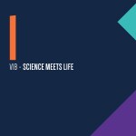
Based on these headlines, the new VIB tagline was created:
“Science meets life”
Next to the headlines, we created a logo that would be expandable enough so that each division could have its own version. Knowing how important the old logo was to VIB, we based the new logo on the old one, giving it a more modern look and feel, with stronger colours and various shapes.
Applying the tangram principle – geometrical puzzles than can be used to create different shapes) – we created logo variations for the divisions of the institution. The version for the research departments is based on Rodin’s Le Penseur (The thinker). The version for the core facilities represents the service sector. Each variation of the logo is of course different, but they can all be recognised as belonging to VIB. This gives flexibility and expandability for each division to have its own identity while keeping a sense of the VIB community.

